


Jeff Carter: “The Singer Pavilion Project” at HPAC
Review
The film poster merits recognition as a sovereign artistic medium rather than a mere marketing tool, long relegated to the shadow of its respective film. Since the poster designer is tasked with distilling a single image from a film’s vast visual field, it is productive to reexamine the film poster as a genre in its own right. Accordingly, exhibitions of film posters face the challenge of spotlighting these posters as artworks, situated as much within the history of graphic design as within that of cinema.
Poster House’s recent showcase of Peter Strausfeld (1910–80), Art for Art House: The Posters of Peter Strausfeld, offers a pertinent case study. Curator Tim Medland took on the ambitious task of surveying the breadth of Strausfeld’s postwar career at the Academy, London’s central arthouse cinema until its closure in 1986. Ultimately, though, the show’s execution reiterates common conceptions of film posters as mere accessories to film.
Trained as an illustrator and animator, Strausfeld befriended filmmaker and Academy director George Hoellering during World War II, when both men were interned in a camp on the Isle of Man for German nationals. After the war, they returned to a bombed-out London that would remain economically and infrastructurally volatile in the decades after the Blitz. Hired by Hoellering in 1947, Strausfeld proved resourceful by designing in linocut, a low-cost mode of printing from scraps of linoleum flooring and other household materials. Beyond its economic benefits, linocut would have seemed a counterintuitive choice for film posters, its stark geometries and limited color palette being incompatible with the fine details of celebrity portraiture. Undeterred, Strausfeld worked with the linocut’s innate particularities, channeling the affective qualities of arthouse cinema so successfully that the Academy employed him until his death. His tenure there thus spanned the shift from postwar realism to the avant-garde new waves and, later, the heady auteur-driven New Hollywood of the 1970s.
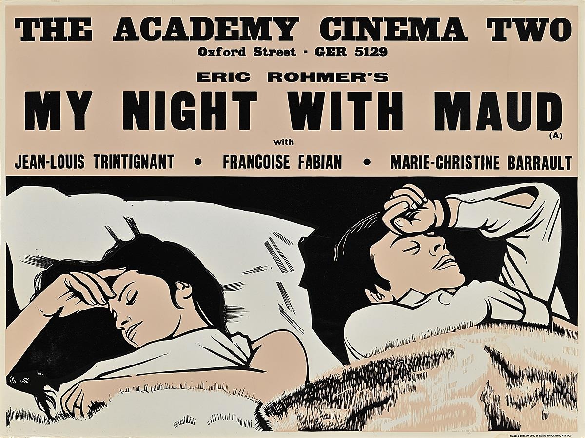
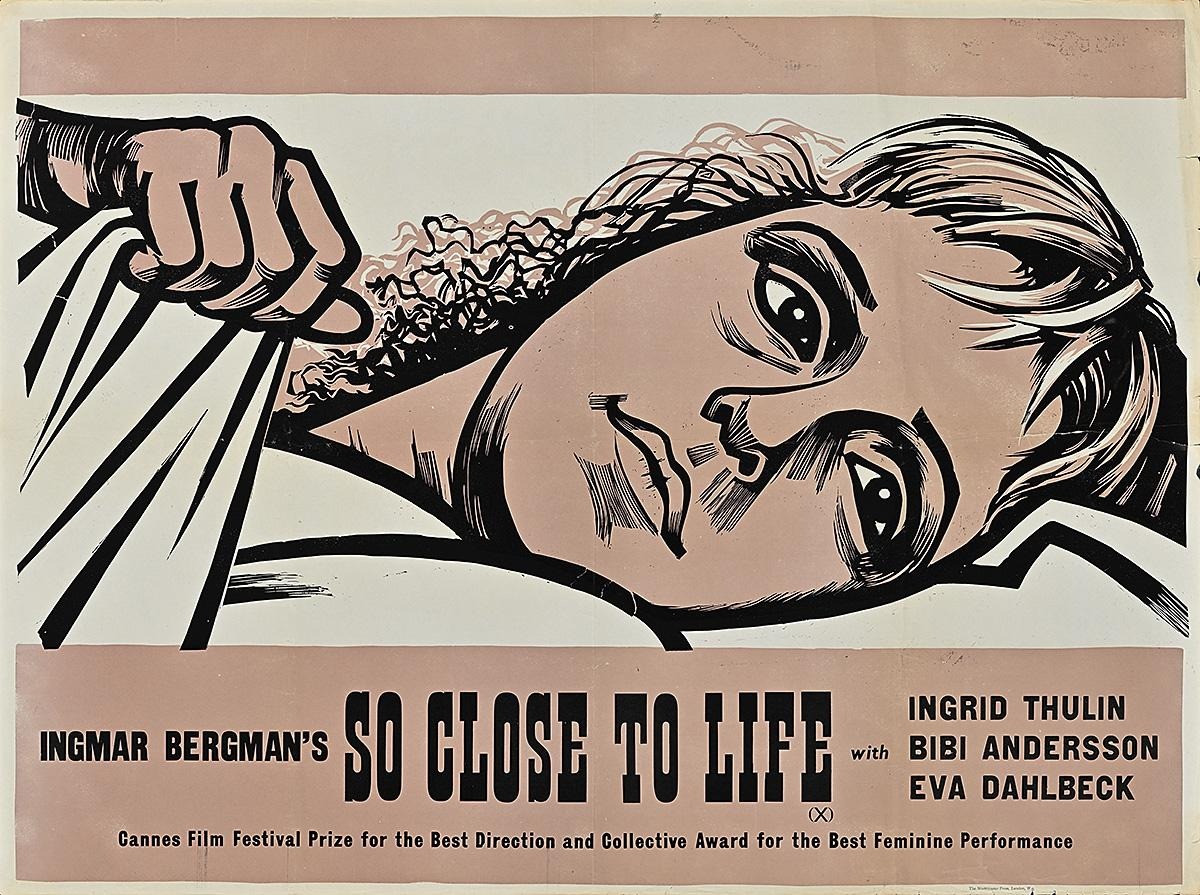
The exhibition is relatively small, with most posters loaned from one private collection. Accordingly, the curators present posters for well-known classics alongside those for more obscure films. This balance keeps the focus on Strausfeld himself, foregrounding the motifs and juxtapositions that define his visual language. Certain traits recur across multiple posters, such as his unique tendency to depict leading actors in reclining poses. This positioning lends tacit eroticism to the bedded couple—played by Jean-Louis Trintignant and Françoise Fabian—in Éric Rohmer’s nouvelle vague classic, My Night at Maud’s (1969). In sharp contrast, the same positioning exudes vulnerability with the haunted, supine visage of Eva Dahlbeck in Brink of Life (1958), a lesser-known work by Swedish director Ingmar Bergman.
On the whole, however, the show’s attention to the films is disproportionate. The wall captions provide sufficient background on Strausfeld, the linocut medium, and the Academy. Otherwise, they primarily summarize the films for non-cinephile museumgoers, engaging with the posters’ aesthetics only in cursory terms. The tour guide’s script, similarly, centered on the films and their streaming availability. Moreover, the introductory wall text refers to the films dismissively as “niche” products aimed at a narrow audience. At the same time, these conditions arguably proved a blessing for Strausfeld, granting him an unusual degree of artistic freedom. It follows that the posters are best understood and scrutinized as artworks; that the exhibition neglects to do so is a missed opportunity.
The evolution of linocut in Strausfeld’s hands could have provided a fruitful avenue for the show. In the interwar era, the influential Grosvenor School had elevated the medium from the league of children’s art, crafting vibrant prints on a shoestring budget. Seen alongside these prints, Strausfeld’s broadsheets represent a distinct formal advancement. Where Grosvenor artists favored streamlined figures—drawing on Futurism and Vorticism to visualize the rhythms of modern life—Strausfeld brought that momentum to a standstill, adapting the medium to more static, often close-up figures while introducing greater detail and psychological nuance. Although an exhibition including Grosvenor artists would present certain difficulties, such a pairing would help underscore Strausfeld’s unique ability to adapt the medium to poster design.
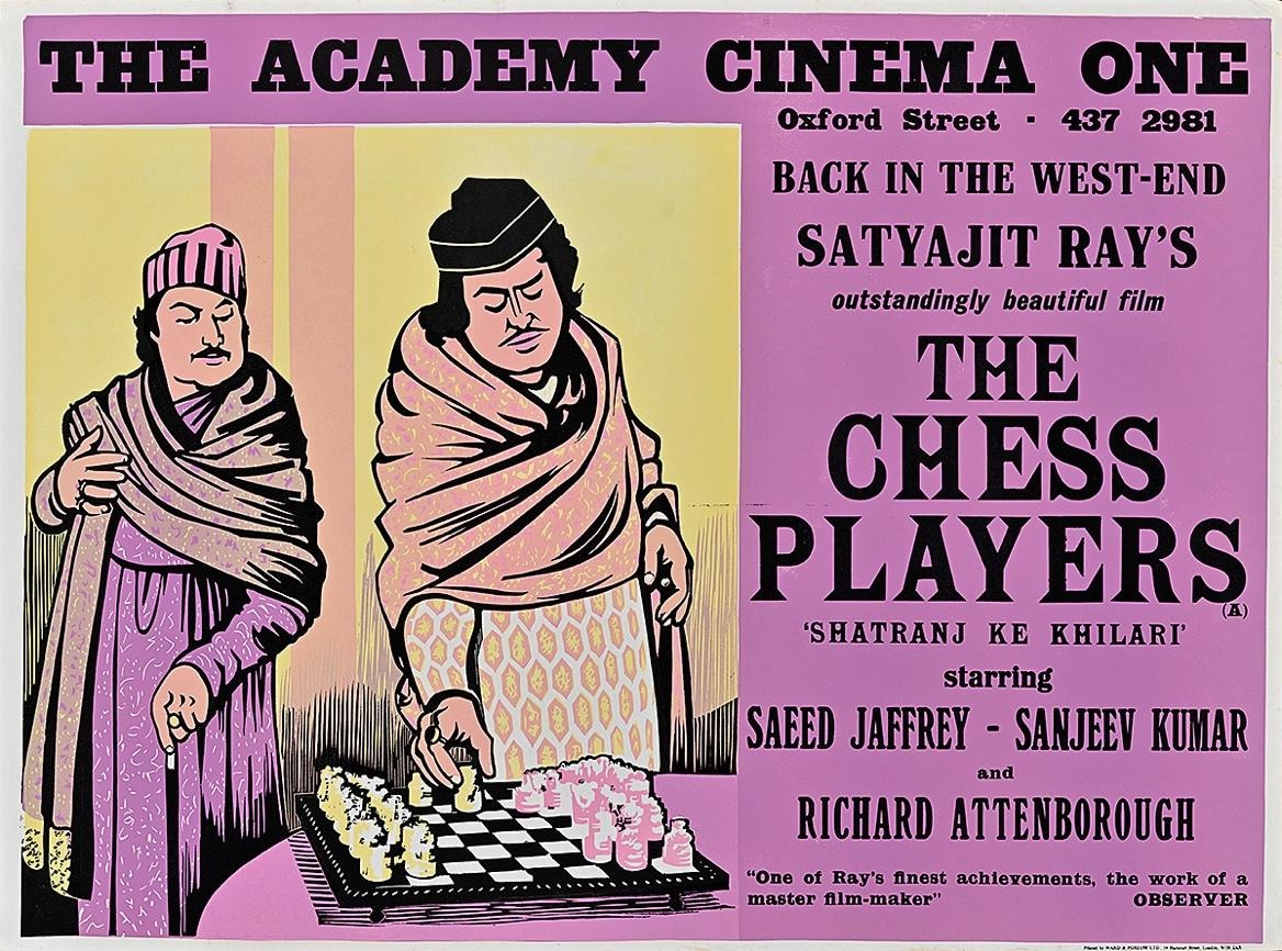
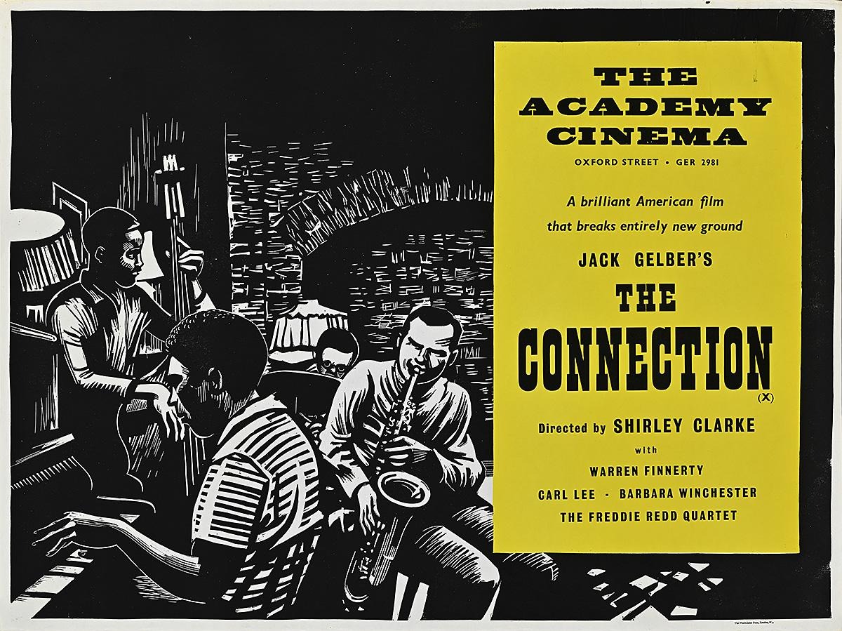
In the poster for Brink of Life—a fearless social-realist portrayal of a maternity ward—the linocut proves particularly well-suited to the thick black contours of Dahlbeck’s face, her blanket, and her tightened hand. In contrast, the finer hatchwork of her facial shadows and her frazzled hair demonstrate Strausfeld’s technical precision. In a different, more satirical genre, the broadside for Satyajit Ray’s The Chess Players (1977) portrays a pair of North Indian nobles captivated by a gameboard. Black lines similarly define the drapery of their lavish garments, while more intricate cuts are evident in the salmon-orange and purple patterning and the sculptural details of the chess pieces. Perhaps the most demanding hatchwork appears in the design for Shirley Clarke’s The Connection (1961), which calls to mind a Lynd Ward woodcut in its depiction of a bebop band in an upbeat jam session.
Viewing these works as linocuts, carefully hewn by hand, encourages an appreciation of these posters as artworks—a perspective that this exhibition frustratingly forgoes. The posters themselves confirm the deftness and discernment with which Strausfeld translated film stills into print, asserting his interpretive spin without losing the integrity of the respective films. These posters more than deserve serious study, and belong in a show that affirms their visual mastery.
Art for Art House: The Posters of Peter Strausfeld was on view at Poster House in New York City from November 13, 2025 through April 12, 2026. The exhibition will be shown at the Jacob Burns Film Center in Pleasantville, New York from July 15 through December 15, 2026.