
.jpg)

.webp)

Xingzi Gu: "Periphery Dreaming" at Make Room
Review
In David Hockney's Portrait of an Artist (Pool with Two Figures) (1972), a man, fully dressed in a pink blazer and leather shoes, stands at the edge of a swimming pool. Behind him, a landscape of lush green hills unfolds. His stare pierces through the surface of the water at another man swimming in a pair of white swimming trunks. The water is a barrier at once transparent and impenetrable, separating the two figures into isolated planes of existence. The man standing alone, his shadow stretching across pale tile, is Peter Schlesinger, with whom Hockney had just ended a tumultuous relationship. There is a certain loneliness to the voyeur, and the painting captures this sharp moment of apartness, despite the swimmer being modeled by Hockney's friend and assistant.
Swimming pools recur throughout Hockney's work, from Peter Getting Out of Nick's Pool (1966), to A Bigger Splash (1967), to his composite Polaroids of the 1980s. Hockney frequently quoted the 17th-century poet and priest George Herbert: "A man that looks on glass / On it may stay his eye; / Or if he pleaseath, through it pass / And then the heaven espy." "I've always loved that poem by George Herbert," he told the critic Martin Gayford in 2021's Spring Cannot be Cancelled. "It's very good because you can look on glass. And if you do look at glass, you can't see through it, but then your eye can decide to go through it."
This fascination with perspective, motion, and the artifice of simultaneously perceiving the surface and the depths of the water is perhaps best exemplified in Hockney's stage productions. It's as if his swimming pool is now upright: the stage proscenium is the pool, the surface of the water the Brechtian fourth wall. "What the opera designer does is analogous to a film composer, but in reverse," he told Artforum. "I create what you see to enhance what you hear." Between 1975 and 1992, Hockney would design seven opera productions in England and America.
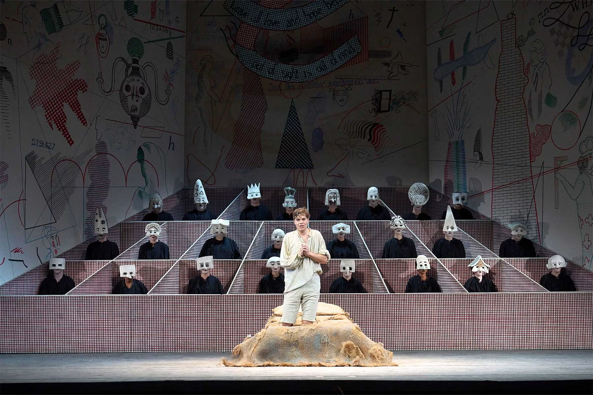
In 1975, the Glyndebourne Festival decided to present a new production of Igor Stravinsky's 1951 opera The Rake's Progress. The Russian composer, in collaboration with librettists W.H. Auden and Chester Kallman, transformed Hogarth's paintings into a modernist stage work, full of spiky harmonies, neoclassical orchestration, and idiosyncratic word-setting. The 1975 production was directed by John Cox, Glyndebourne's then-director of production, and in a 2020 interview for Glyndebourne, Cox recounts why he wanted Hockney to design the sets and costumes: Hockney had already done a whole series on A Rake's Progress after leaving the Royal College of Art, making him "somebody who had thought of the subject and who would be comfortable with this kind of moralistic tale."
As in his 1961 A Rake's Progress, Hockney's stage designs for the Stravinsky opera take Hogarth's cross-hatched etchings as a starting point. But the depth and movement of the stage open up new opportunities in forced perspective: the two-dimensional, baroque-style stage flats open up into three dimensions, with flat etchings of chandeliers, chairs, and beds rising and falling into view. The costumes, rendered largely in black-and-white etched fabric, give the effect of a Hogarth engraving come to life—and then the illusion is subverted by the movement of the singers, sets, and lighting.
In the final act of Stravinsky's opera, the titular Tom Rakewell finds himself consigned to an asylum, in front of a trompe l'oeil etched backdrop depicting an array of psychiatric cells. As his abandoned fiancée rocks him to sleep with a gentle lullaby, masked singers appear from within each cell, and the audience realizes the full extent of Hockney's visual trickery. It's a breathtaking theatrical coup, and Hockney's production, last revived in 2023, remains the longest-running opera production in the UK and has traveled to Paris, New York, Milan, and Sydney.
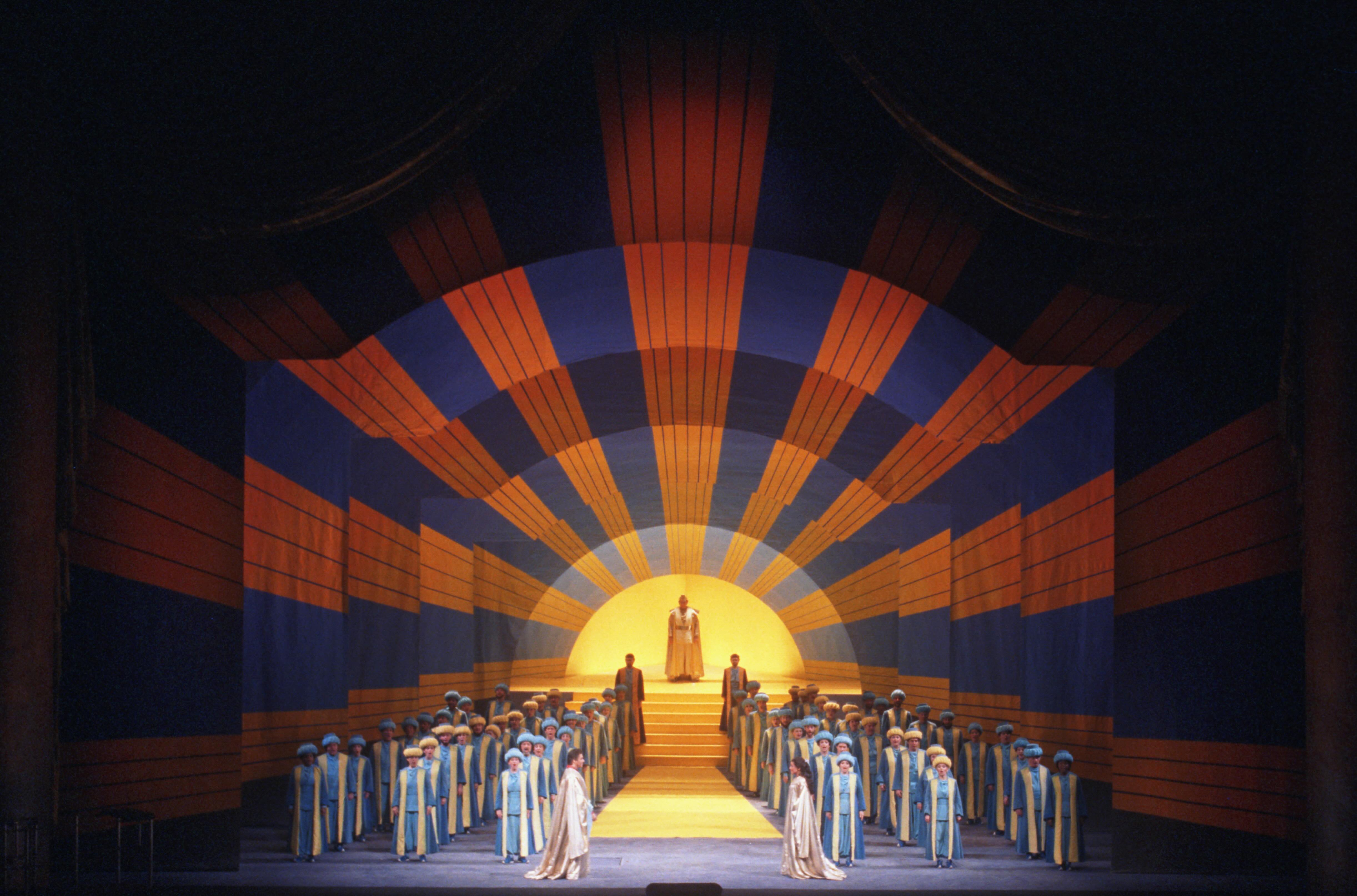
Hockney and Cox collaborated three years later for a new production of Mozart's Magic Flute. Like The Rake's Progress, Mozart's opera is a moralistic fable, but instead of the black-and-white seediness of London we find ourselves in a fantastic, technicolor ancient Egypt. Hockney travelled to Egypt for inspiration and rendered the pyramids, temples, and greenery in vibrant blocks of color. Sarastro's kingdom, with its neatly arrayed gardens and ponds, anticipated the saturated color blocking and compartmentalization of his multi-canvas paintings in the 1970s and his composite Polaroids in the 1980s, where he would play around with discontinuities of color and scale.
As with The Rake's Progress, Hockney's sets for Magic Flute are deliberately two-dimensional, with nested stage flats suggesting depth: flats moving in and out as they did in Mozart's time, crisp and clear like an Italian painting with everything in focus. The final scene, depicting the triumph of Sarastro's Enlightenment ideals over the Queen of the Night, contains a typical Hockneyian coup: a nested series of stage flats are successively lit from within, depicting the rays of the sun radiating out from the darkness.
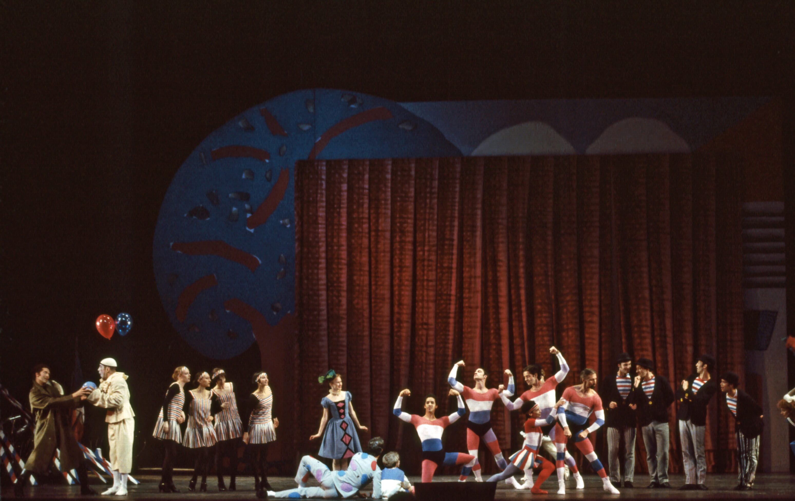
Hockney was next hired by New York's Metropolitan Opera to design two triple bills: a French program consisting of Satie's Parade, Poulenc's Les Mamelles de Tirésias, and Ravel's L'enfant et les sortilèges, and a Stravinsky program consisting of The Rite of Spring, Le Rossignol, and Oedipus Rex. Both programs involved a mix of opera and ballet, adding a layer of complexity to Hockney's designs—his costumes would have to accommodate Frederick Ashton's choreography for Natalia Makarova and Anthony Dowell in Le Rossignol.
For Parade, Hockney was following in the footsteps of one of his own artistic heroes: the sets and costumes for its 1917 premiere had been designed by Pablo Picasso, whose "boldness and simplicity of color were revolutionary." Hockney's version went a different way, offering a gentler, more nostalgic vision of France in blue, white, and red stripes and exaggerated silhouettes anticipating Jean-Paul Gaultier—though not entirely nostalgic, since the stage was surrounded by French flags atop a barbed wire fence, recalling the ballet's premiere in a besieged Paris.
Hockney wouldn't return to the operatic until 1987, when he tackled three of opera's most challenging works in quick succession. Wagner's Tristan und Isolde premiered in Los Angeles, followed by Puccini's Turandot in Chicago and Strauss's Die Frau ohne Schatten in London. The three works share a structural and harmonic ambition, and Hockney's designs all make use of extreme forced perspective, strong backlighting, and a restricted color palette mostly comprised of reds and blues, as if to heighten the allegorical symbolism of all three works.
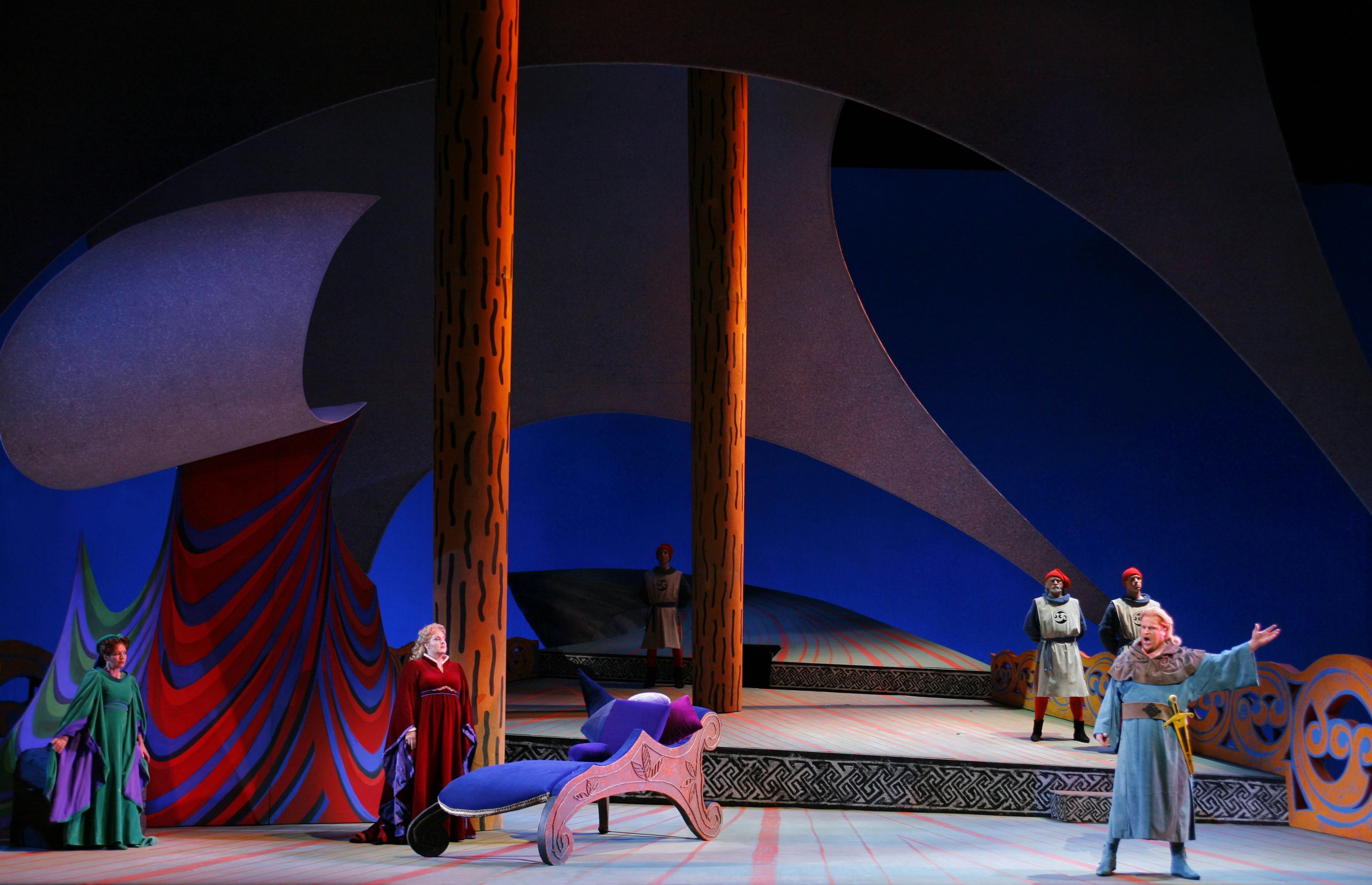
Wagner's Tristan und Isolde represents a turning point in opera, with more written about its famous "Tristan chord" than perhaps any other chord in history. It's an extraordinarily ambitious work, over five hours of torturous and ecstatic longing, and its Romeo and Juliet-esque tale of forbidden love juxtaposes the eroticism of night with the duty of daytime. Hockney's set makes use of a row of trees stretching into infinity—the foliage is a stylized Celtic knot, a nod to the story's mythological origins—and as night gives way to dawn, the shadows of the trees cast increasingly stark shadows.
His production of Puccini's Turandot makes use of a similar design, contrasting the rigid authoritarianism of Turandot's bloodthirsty dominion with the shadowy nighttime that gives rise to the opera's most famous aria, "Nessun Dorma—none shall sleep. Puccini's opera is an orientalist fantasy, but Hockney avoids the temptation to fall into cliché. Rather, his designs hint at Imperial China through curved Xieshan roofs and translucent panels with ink wash paintings, recalling the stylized watercolors from his China Diary documenting his 1981 trip to China. In a 1989 interview for Artforum, Hockney described his approach as "taking out the dragons"—stripping away the "grotesque chinoiserie" that made most previous productions look "unbelievably overdesigned."
But Hockney's hallucinatory, phantasmagorical production of Strauss's Die Frau ohne Schatten is the one that fascinates most. Long considered Strauss's most challenging opera, the plot is a near-incoherent hybrid of Arabian folklore, Mozart's Magic Flute, Goethe, Grimm, and Freud. It's full of arcane symbolism and impossible stagecraft (the titular "woman without a shadow" is a nightmare for any lighting designer), but rather than aiming for the literal, Hockney leans into the colorful opulence of Strauss's score.
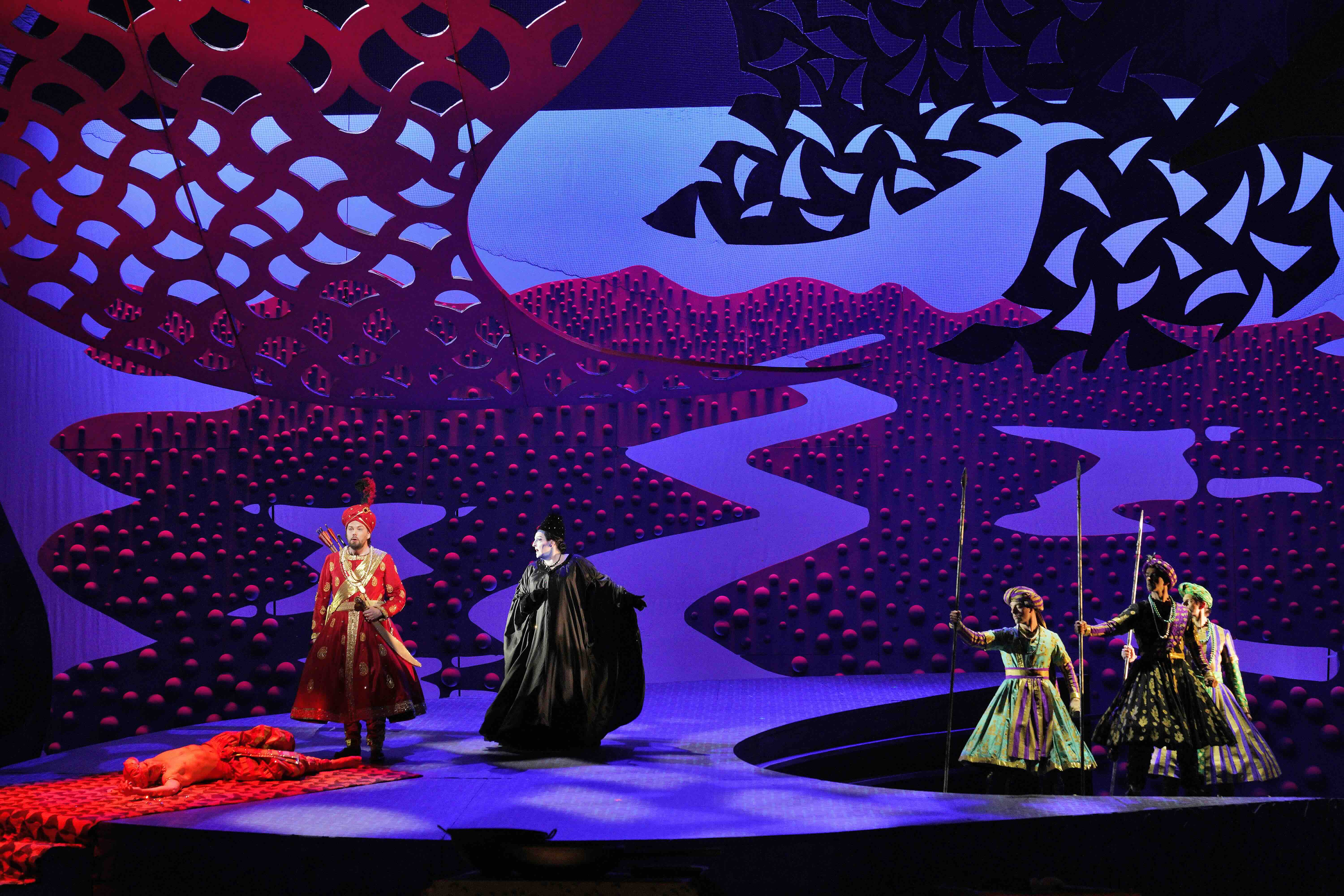
Hockney's designs are a sensory overload: there are textured, pustular trees that twist and turn, anticipating Yayoi Kusama's cephalopod sculptures; there are giant Erlenmeyer flasks streaked with color, in a nod to one of the characters who works as a fabric dyer; there's a giant backlit sperm. Once again, Hockney makes use of a strict blue-red color scheme, contrasting the cool restraint of the spirit world with the vibrant heat of humanity.
Die Frau ohne Schatten would be Hockney's last opera production, which the artist blamed on his increasing deafness. Although his operatic period was relatively short considering the longevity of his career, it marked a decisive shift in his artistic outlook. Many of his early paintings maintained a strictly formal composition and fixed point-of-view, from his swimming pools to his series of double portraits, reflecting a Renaissance-like geometrical point-of-view.
Yet a fixed perspective is impossible in the theater, especially in the horseshoe-shaped conformation that comprises the majority of European opera houses. Instead, Hockney opted to make use of forced perspective in his set designs, from the deceptively flat crosshatching in The Rake's Progress to the exaggerated angles in Turandot, whose non-Euclidean geometries—looming buildings, off-kilter stairs—lend an ominous, labyrinthine feel to the sets.
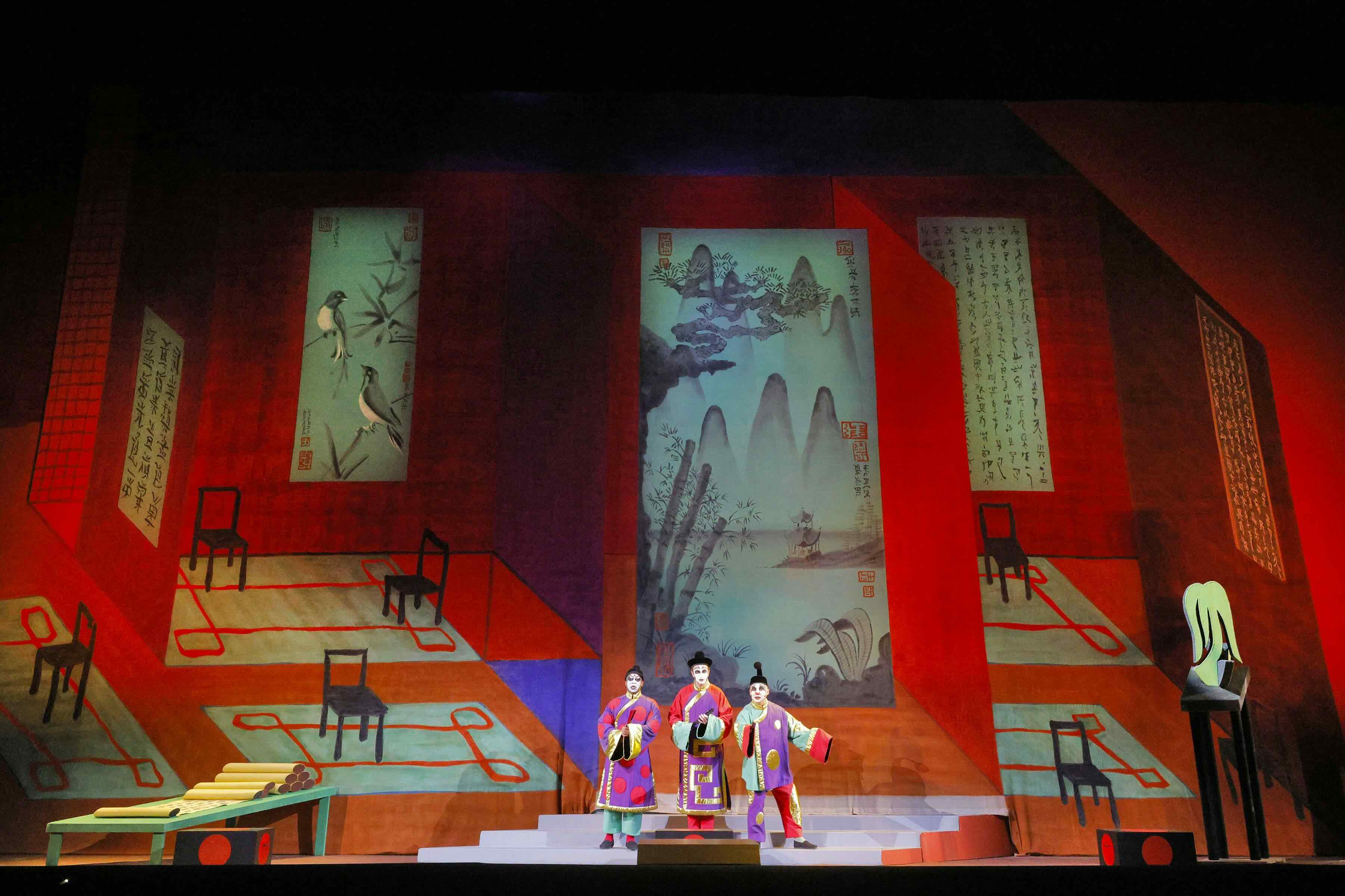
Hockney's exploration of onstage point-of-view coincided with similar experiments within his studio. His 1982 exhibition at Paris's Centre Pompidou saw him experimenting with elaborate photo-collages, arraying up to 120 Polaroid photographs in grid form, each taken from a slightly different perspective and assembled to form a single image with a Cubist edge—as close as he had yet come to paying homage to Picasso by style.
One can also trace the evolution of Hockney's embrace of color through his operas. While his early paintings and The Rake's Progress are largely rendered in muted, complementary pastels and geometric lines, his riotous, joyful use of color and sinuous, curving lines in Magic Flute predates his Mulholland Drive: The Road to the Studio (1980). He would continue his love for exuberant color, off-center angles, and dramatic lighting throughout his career, from his acrylic painting A Bigger Interior with Blue Terrace and Garden (2017) to his many depictions of winding paths in Yorkshire and Normandy.
But perhaps opera's greatest impact on Hockney had less to do with his art and more to do with how he wanted audiences to view his art. His 2012 exhibition A Bigger Picture at the Guggenheim Bilbao had spectators bring their own iPads, and was accompanied by a filmed gallery tour shot on three different cameras to simultaneously display different perspectives; his 2023 Bigger & Closer (Not Smaller & Further Away) immersed spectators within the swirling colors of his paintings, photographs, and opera sets. Gimmick or not, both aimed to disrupt the standard gallery-going experience and encourage viewers to experience art in new, theatrical ways. "Opera is theater of excess, and we need more of it," Hockney said in a 2011 interview for Glyndebourne. "That's what it is: bigger than life!"






%20.jpeg)