From the artist:
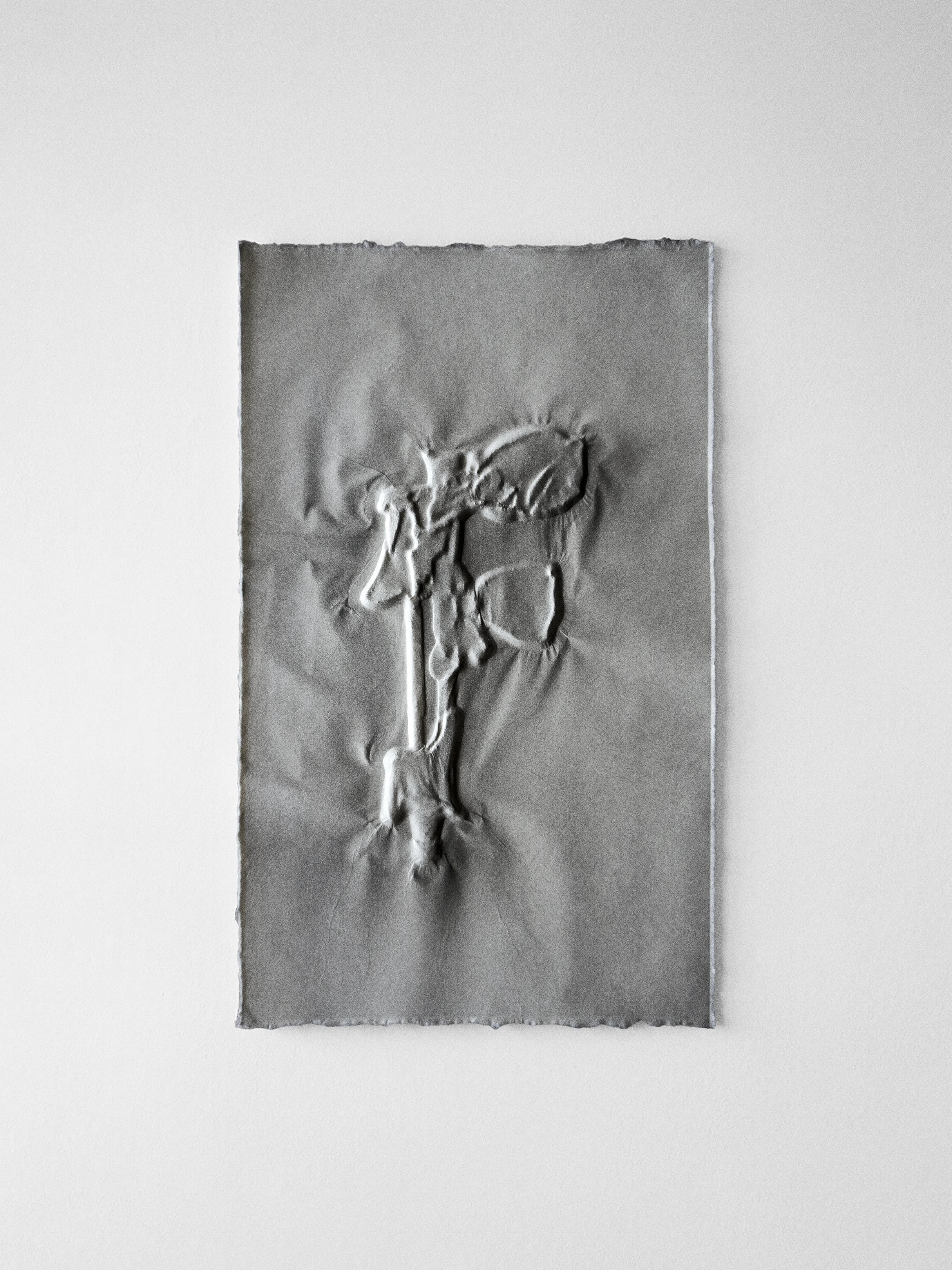
Lately I've been drawing letterforms. The latin alphabet is over 2000 years old. It's a persistent and ubiquitous technology. As a visual system it predates most modern inventions by millennia.
When I first started on this edition, I planned to draw an I for Impulse; after my friend and gallerist Francisco Correa Cordero passed away, I turned the I into an F in his honor. Francisco was so devoted to artists that he sacrificed almost everything else. For someone involved in aesthetics, he had an almost ascetic indifference to the trivial details: he cared only for the big picture. He wore the same outfit the nearly ten years that I knew him.
The latin alphabet is similarly impervious to changing fashions; despite endless redesign in response to technological advancements and prevailing ideologies, its basic structure remains unchanged in the last 500 years.
At work, I draw letters too, at an agency that designs brand identities for luxury clients. In usage, the design and legibility of each letter effects the tone, emotion, and perception of its content. For me, the individual letter is a skeleton on which to sketch endless variations, pushing toward illegibility. It's said that invention in isolation is indistinguishable from madness, but these works help me stay sane.
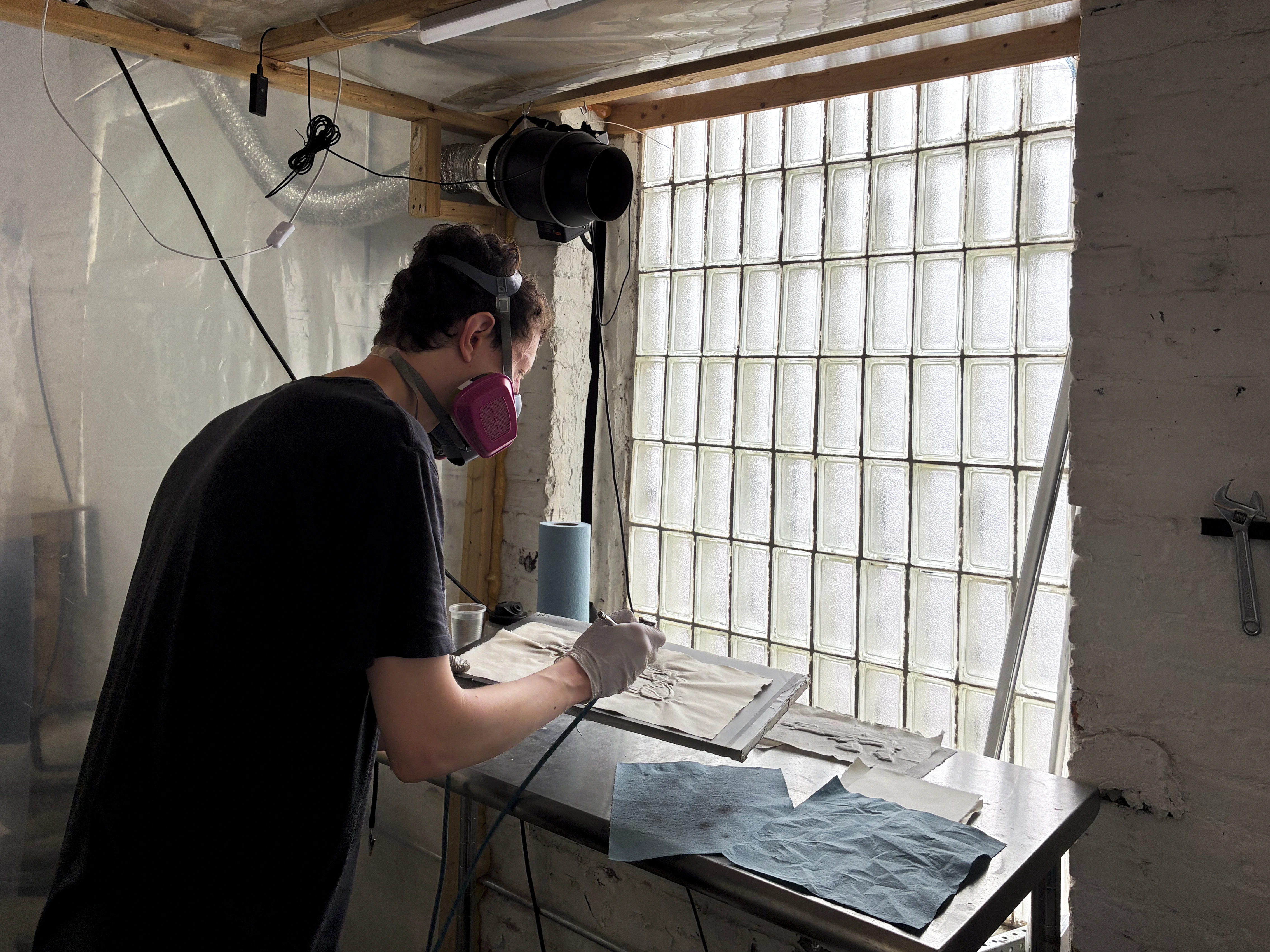
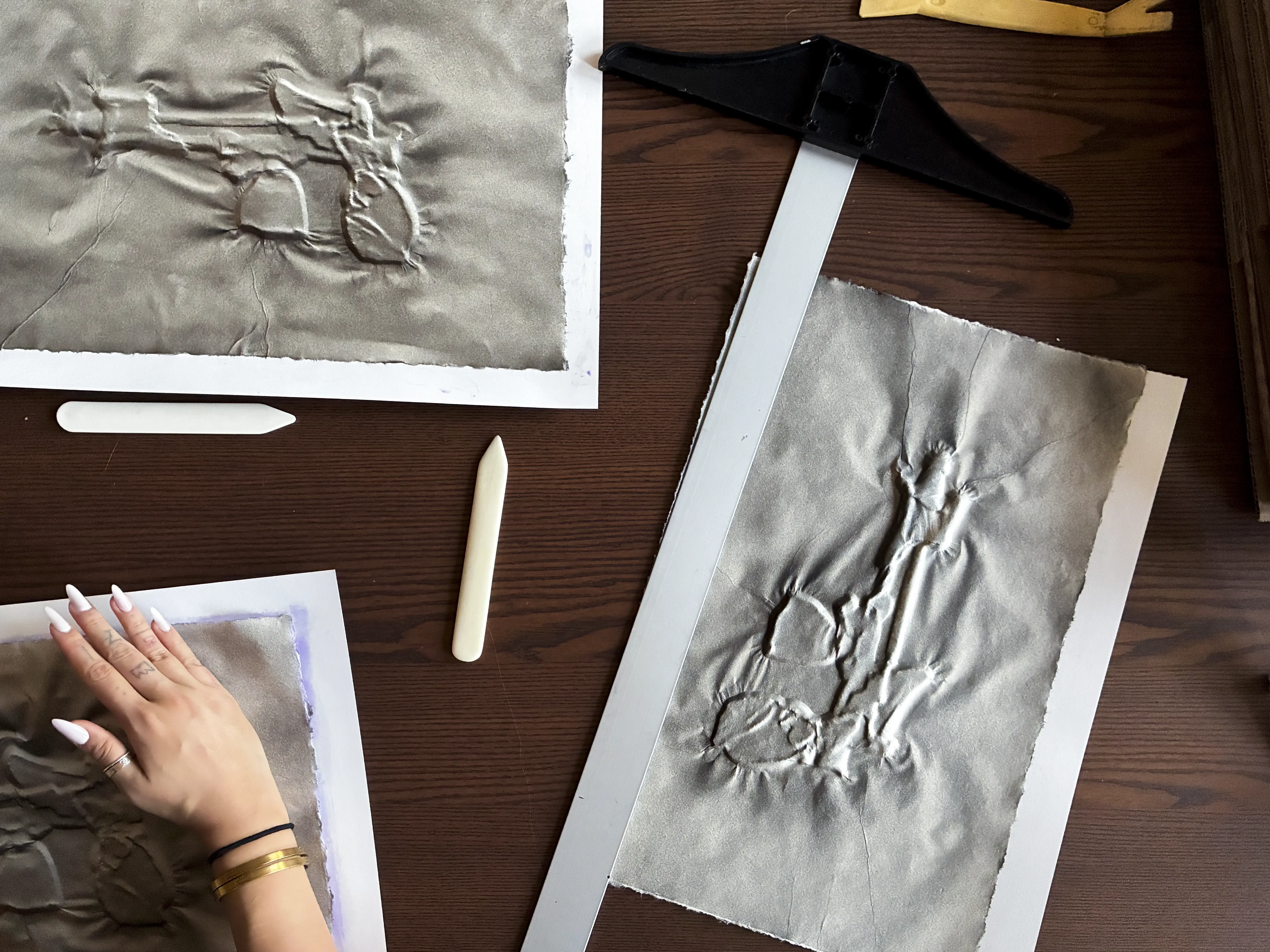
Printed by Victoria Reshetnikov.
Printing support from Jubilee Park and Kasper Bielecki.

.webp)